Last fall, we announced the prototype of a new phone optimized ePaper solution, called Mobile Edition. The basic concept is to extract articles from the newspaper and present them easily accessible on the front screen of the app. In a few seconds the readers should be able to get a comprehensive overview of today’s paper, and identify interesting stories.
We wanted to go from a pure replica edition to a thumb-pleasing news format that fits small screen sizes. One that is relevant in those moments, where we grasp for our phones to get a news fix. Like waiting at the bus stop or killing time in the supermarket que.
Looking into the usage of ePaper apps for phones and tablets across the Visiolink customer base, we recognize that only 13 % of all newspapers are read on a phone, while 65 % are read on tablets. The remaining 22 % come from web. This contradicts general usage patterns stating that phone usage far surpasses tablet usage. And on top of that, worldwide tablet shipments are declining while smartphone sales continue to rise.
The average person between ages 18 to 33 check their phone 85 times a day, which amounts to five hours of neck bending screen activity every single day. What if just a fraction of that time could be spent on reading the ePaper? Is it possible for a traditional lean back medium to compete for the snack news moments within a segment younger than the average newspaper reader?
We have asked a series of customers to test Mobile Edition, to give us an indication of the reception of this new concept. Our concerns focused on splitting up the carefully designed newspaper. The format follows strict and very well-known conventions of how to serve a flow of articles to the reader. Other than this breach of format, our tests also focused on how to let the new format step into the foreground and at the same time not abandon users, who are pleased with the replica format. Our thesis was that this group of users still needed to be able to access the replica newspaper easily.
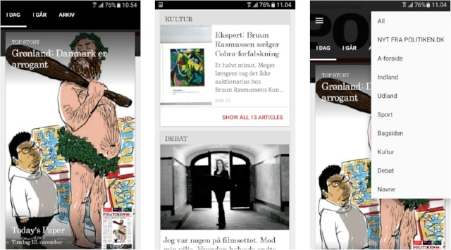
1: Front screen of Mobile Edition with a teaser for the most important article. The replica edition accessible in the bottom right corner.
2: Scrolling down from the top story, the categories of the newspaper will appear.
3: A filter function will allow the reader to jump to a certain category
Very positive reactions
The reception of Mobile Edition among our test audience was overwhelmingly positive. Especially the increased usability and fast access to content tailored for phone usage patterns was approved. None of the test customers had any concerns about the fact that the Mobile Edition format deconstructs the newspaper, as long as it is done with the purpose of optimizing how news stories are consumed on the phone, and as long as content categories are recognizable.
The link to the replica edition, in form of a thumb nail image in the bottom corner of the top story teaser, split the test customers. Some had the opinion that the concept was not radical enough. They thought that if you move away from the replica edition, you should go all the way and only display the articles of today’s paper in one tab and live news in a second tab. This way the news stories are highly topical whenever the reader opens the app. Others thought that the link to the replica edition was crucial. Both in order to ensure readers that content is the same in both formats and in order to make it available to readers who are used to access the replica.
Most test users agreed that changing the primary format from replica to an article based format that suits the smartphone usage patterns, has the potential to attract both more existing readers and a new and possibly younger audience to the platform
During our tests we came across a number of whishes on a more detailed level, and the test phase has given us plenty of inspiration for the process of designing and developing the first deployable version of Mobile Edition. Early 2017 we will announce, when the first version will hit the market.
Facts: The Mobile Edition app
- The front screen of the app presents the automatically selected top story of the newspaper
- The replica edition is accessible through thumb on the front screen
- Scrolling down, an overview of all categories will appear with the first story of each category presented by headline and picture
- All categories can be expanded to show a teaser of each article
- Once logged in, the reader has full access to all articles directly from the front screen
- A filter function lets the reader chose a preferred category
- The Mobile Edition is integrated in the existing app and will be accessible for smartphone readers
Did you know, newspaper readers are moving to mobile? Read the survey here: