Visiolink's new display format, DYNAMIC, has completed its first year of use and has now been launched in over 70 apps in Scandinavia. In addition, a new version was recently released for use with Android devices.
It began as a research project in which both theory and user surveys laid the groundwork for a new display convention that retains full respect for the editorial prioritisation of a newspaper's content, as well as for the well-known newspaper format with spread display, a clear beginning and end, and the possibility of being able to skim and read content in depth. In short, it is a fully automated re-layout of the newspaper.

By allowing theory to meet reality's newspaper content day after day, we've caught a glimpse of how reality may ultimately trump theory, and to which extremes we need to design. The process has given us input for the first large-scale upgrade package for DYNAMIC, which will be launched for iOS in February 2015. It contains a long list of improvements, all of which contribute to a clearly improved reading experience. Furthermore, clients who already have DYNAMIC will be pleased to know that the package can be obtained without having to resubmit their apps.
What does the package contain?
The upgrade package was developed in collaboration with the Danish School of Media and Journalism and primarily contains modifications that create visual effects for the reader. The goal has been to minimise the visual and comprehension divide between the 1:1 version and DYNAMIC, so that the transition between the two display formats will be as smooth as possible. This is where we find the four most significant changes.
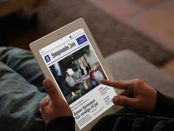
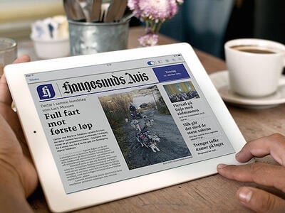
Front pages
The newspaper's front page provides access to the day's news and should entice the reader to purchase the newspaper or continue reading. Out of respect for the prioritisation work that lies behind selecting the day's top stories, we have designed a number of new front pages that can, to the extent possible, embrace different types of stories. The design thus resembles a classic newspaper layout, which creates a credible association to the printed edition. This in turn creates a sense of comfort and increases a reader's willingness to pay for content. Furthermore, there are no graphic elements and headlines inserted in over images, as the automatic process means we are unable to subsequently edit the position of the elements.
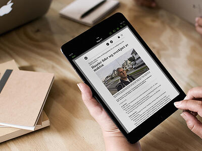
Typography and content elements
Typography in a newspaper plays an extremely important role when it comes to the publication's identity, and can serve as the key characteristic associated with the newspaper. We have therefore worked to find suitable fonts that function in a generic newspaper look. This is particularly visible when one opens an article in Article View:
In the long run, we hope to define three to four typography sets that can each be used for different styles, e.g. tabloid and broadsheet.
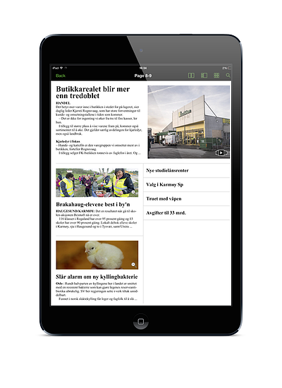
In this upgrade package, we have also worked to express the prioritisation of content by using typographic indicators. For example, the headline of the most important article in a spread will be twice as large as the headline of the second most important story.
We have furthermore ensured that all content elements will be represented if they are found in the material we receive from the media company. If a kicker or a lead is missing, the development of the story can be lost, which creates the wrong conditions for the readers' ability to decode the article's message.
Poor content
Articles without headlines, sport results, TV programmes, stock prices... All in all, content that is very poorly presented in DYNAMIC. We've created a mechanism that is able to sort content based on criteria such as missing headlines, very little body text and text density. The sensitivity of this mechanism can be tuned up and down so that we do not risk sorting true content. At the same time, we generate a report that shows which articles have been discarded and for what reason.
We already have an alternative solution for showing TV listings with an interactive overview that is much better suited for a digital format than the daily programme listings printed in the newspaper.
Photo cropping
Quality images make up a crucial element in the immediate understanding of an article's message. It is therefore vital that photos are not cropped, as the message-bearing elements risk becoming lost. That is why we have implemented dynamic photo spaces in all spreads. This means that a photo's height-width ratio is maintained, so that the entire image is always shown.
White space
Empty spaces on digital platforms are most often seen as mistakes. In the new package, we have therefore either eliminated white space by dynamically filling it with body text near paragraph fields, or actively used white space in the design so that it no longer looks like the relevant spread mistakenly lacks articles to fill out the space. This change will greatly influence the overall experience of DYNAMIC.
 The upgrade package also contains a number of other improvements that are less visible for the end user. For example, it is now possible to book interstitials via Cxense (Emediate), ADTECH and Visiolink.
We look forward to introducing the new package in February!
Note: All illustrations are temporary sketches and may be changed prior to the launch of the upgrade package.